
Instagram, one of the world’s most popular social media platforms, has a distinct visual identity that extends to its typography. From the app interface to captions, bios, and marketing materials, Instagram uses a variety of fonts to maintain consistency and enhance user experience. In this article, we’ll explore the fonts Instagram uses in different contexts, how they’ve evolved, and how you can customize your own text to stand out.
What Font Does Instagram Use? Instagram’s Official Font: Instagram Sans
In 2022, Instagram introduced its own custom typeface called Instagram Sans. This font was designed to reflect the platform’s modern, global, and inclusive identity. The font does Instagram use varies across branding, interface, and user content, with Instagram Sans serving as the primary custom font for branding and marketing. Here’s what makes it unique:
- Design Inspiration: Instagram Sans is inspired by the platform’s logo, which features a gradient and rounded edges. The font has a geometric, sans-serif design with soft curves, making it approachable and versatile. Mackey Saturday was responsible for redesigning the Instagram logo and introducing a new wordmark, which inspired the current visual identity. Instagram Sans was developed in collaboration with Colophon Foundry and is considered a global typeface supporting global scripts.
- Multilingual Support: Instagram Sans supports multiple languages and scripts, including Latin, Arabic, and Thai, ensuring a consistent look across diverse user bases. It is optimized for digital screens and designed to enhance the platform’s visual appeal for a global audience.
- Usage: This font is primarily used in Instagram’s branding, marketing materials, and some parts of the app interface. Typography plays a key role in Instagram’s visual identity and user experience. It’s not available for public use, as it’s a proprietary font created specifically for Instagram.
Image captions under each post are written in the default Instagram Sans font—an easily readable sans serif typeface that complements the Instagram design. This element adds a lot of value to ensuring that your posts are easily readable by the audience. Although the default font assists most users, many wish to know how to change Instagram or other social media fonts.
In the next section, we will discuss the features of Instagram’s font style more precisely and explain how you can customize it to make your publications extraordinary.
Why Instagram Uses Instagram Sans
Instagram employs Instagram Sans for many reasons. First and foremost, it is easy to read across all devices: smartphones, tablets, and computers. Legibility is paramount since tens of millions of users post something every day. Instagram Sans continuously enables the platform to appear and feel right for every type of content. In addition to readability, Instagram’s design choices prioritize a custom style that balances clarity with brand personality, ensuring the font reflects the company’s visual identity and strategic branding decisions.
Also, the font is bare-bones, which does not overpower the content in any post, including a picture, video, or story shared on Instagram. Choosing such a font is useful because a complex typeface can distract the user from the intended visual experience with the software interface. The letterforms of Instagram Sans incorporate a human touch, especially in the Headline style, adding personality and emotional connection that make the platform feel more personal and engaging.
What is Instagram Sans?
Instagram Sans is a custom designed font introduced by Instagram in 2022 as part of a major brand refresh. This geometric sans serif font stands out with its unique curves and friendly, approachable feel, making it instantly recognizable across the platform. Instagram Sans is more than just a typeface—it’s a visual signature that appears throughout the app interface, from the logo to marketing materials and in-app features.
Designed to be visually appealing and versatile, Instagram Sans reflects the platform’s commitment to creativity, inclusivity, and self-expression. Its clean, modern lines and geometric shapes help create a cohesive look that supports Instagram’s mission to connect a global community. By choosing a custom designed font, Instagram ensures that its branding remains fresh, contemporary, and memorable, playing a crucial role in the platform’s overall design and user experience.
2. The History and Evolution of Instagram’s Fonts
Instagram’s journey with typography has mirrored its growth as a global brand. In its early days, the platform relied on widely used fonts like Helvetica Neue and Proxima Nova for its branding and app interface. While these fonts were clean and modern, they didn’t offer the unique identity Instagram needed as it expanded to millions of users worldwide.
Recognizing the importance of a distinct visual presence, Instagram made a pivotal shift by introducing its own custom typeface, Instagram Sans. This move marked a new era in Instagram’s brand identity, allowing the platform to stand out in a crowded social media landscape. Since its debut, Instagram Sans has become a central element in Instagram’s design language, consistently featured in logos, branding, and across the app. This evolution in typography has helped Instagram reinforce its position as a forward-thinking, design-driven platform.
3. The Benefits of a Custom Font for Instagram
Adopting a custom font like Instagram Sans brings a host of advantages to the platform. First, it sets Instagram apart from other social media platforms, making the brand instantly recognizable to users worldwide. The use of a custom font ensures that every aspect of the app interface, from the logo to marketing materials, maintains a consistent and cohesive look.
Instagram Sans also empowers users to create personal and unique content, thanks to its playful shapes and customizable styles. This flexibility supports self-expression and creativity, which are at the heart of the Instagram experience. Additionally, the font’s inclusive design supports multiple scripts and writing systems, ensuring that users from different regions can enjoy a seamless and visually appealing experience. By investing in a custom font, Instagram not only strengthens its brand identity but also enhances user engagement and satisfaction across its global platforms.
4. The Importance of Custom Typeface in Instagram’s Branding
A custom typeface like Instagram Sans is a cornerstone of Instagram’s branding strategy. It helps the platform establish a unique and memorable visual identity, distinguishing Instagram from its competitors in the crowded social media space. The custom font plays a crucial role in shaping the platform’s personality, conveying a sense of modernity, creativity, and approachability that resonates with users.
Consistency is key in branding, and Instagram Sans ensures that every touchpoint—from the app interface and logo to marketing campaigns and social media posts—shares a unified look and feel. This consistency builds trust and familiarity, encouraging users to engage more deeply with the platform. By prioritizing a custom typeface, Instagram demonstrates its commitment to high-quality design and user experience, reinforcing its reputation as a leader in digital innovation and social media branding.
2. Fonts Used in the Instagram App Interface
Instagram’s app interface relies on system fonts to ensure compatibility across devices. Instagram use of system fonts is determined by the operating systems, such as iOS and Android, to ensure compatibility and a similar aesthetic across devices. Here’s what you’ll see:
This approach allows Instagram to maintain a consistent user experience and visual appeal, helping the platform reach a global audience effectively.
iOS Devices
- San Francisco: Apple’s system font, San Francisco, is used for all text in the Instagram app on iPhones and iPads. This font is clean, modern, and optimized for readability on Apple devices.
Android Devices
- Roboto: On Android, Instagram uses Roboto, Google’s default system font. Roboto is a neutral, geometric sans-serif font designed for clarity and simplicity.
These system fonts ensure that Instagram’s interface feels native to the device you’re using, providing a seamless user experience.
3. Fonts for Captions, Bios, and Comments
When it comes to user-generated content like captions, bios, and comments, Instagram uses the same system fonts as the app interface. The font does Instagram use for these elements is typically the system font, but Instagram Stories fonts offer more variety and customization options:
- iOS: San Francisco
- Android: Roboto
In addition to these, users may encounter fonts like Neue Helvetica, Freight Sans, and Comic Sans as options for customizing captions and stories through third-party tools or when using Instagram Stories fonts to enhance their content.
However, users often want to stand out by using unique fonts in their bios or captions. Since Instagram doesn’t allow direct font customization within the app, people rely on third-party tools and Unicode characters to achieve this effect.
4. How to Customize Fonts on Instagram
If you want to make your Instagram bio or captions stand out, you can use special fonts generated by third-party tools. Using great alternatives to Instagram’s default fonts can help increase engagement by making your posts more visually appealing and improving the look of your social media graphics. These tools convert your text into stylish Unicode characters that Instagram can display. Here’s how it works:
Popular Font Generators
- LingoJam: Offers a wide variety of fonts, including cursive, bold, and decorative styles.
- Cool Symbol: Provides unique font styles and symbols for Instagram bios.
- Fonts for Instagram: A mobile app that generates stylish text for captions and bios.
How to Change Instagram Caption Font Style
The main font that is used on Instagram is called Instagram Sans. However, there are methods through which you can change the font on captions on your Instagram page. For those bored with the simple font, there are third-party tools and Web resources that may alter the appearance of captions. These social media fonts enable users to test other fonts of their choice to give the post a variant look. Here’s how to do it:
Step 1: It is also essential to use Third-Party Font Generators.
Of all the methods we are about to discuss, font generators are the simplest method of changing the typography of your Instagram captions. Standard websites include Lingo Jam or Cool Fonts, where you must type in your text and choose various fonts. These tools let you see how your text will be formatted, such as bold text, italic and fancy font.
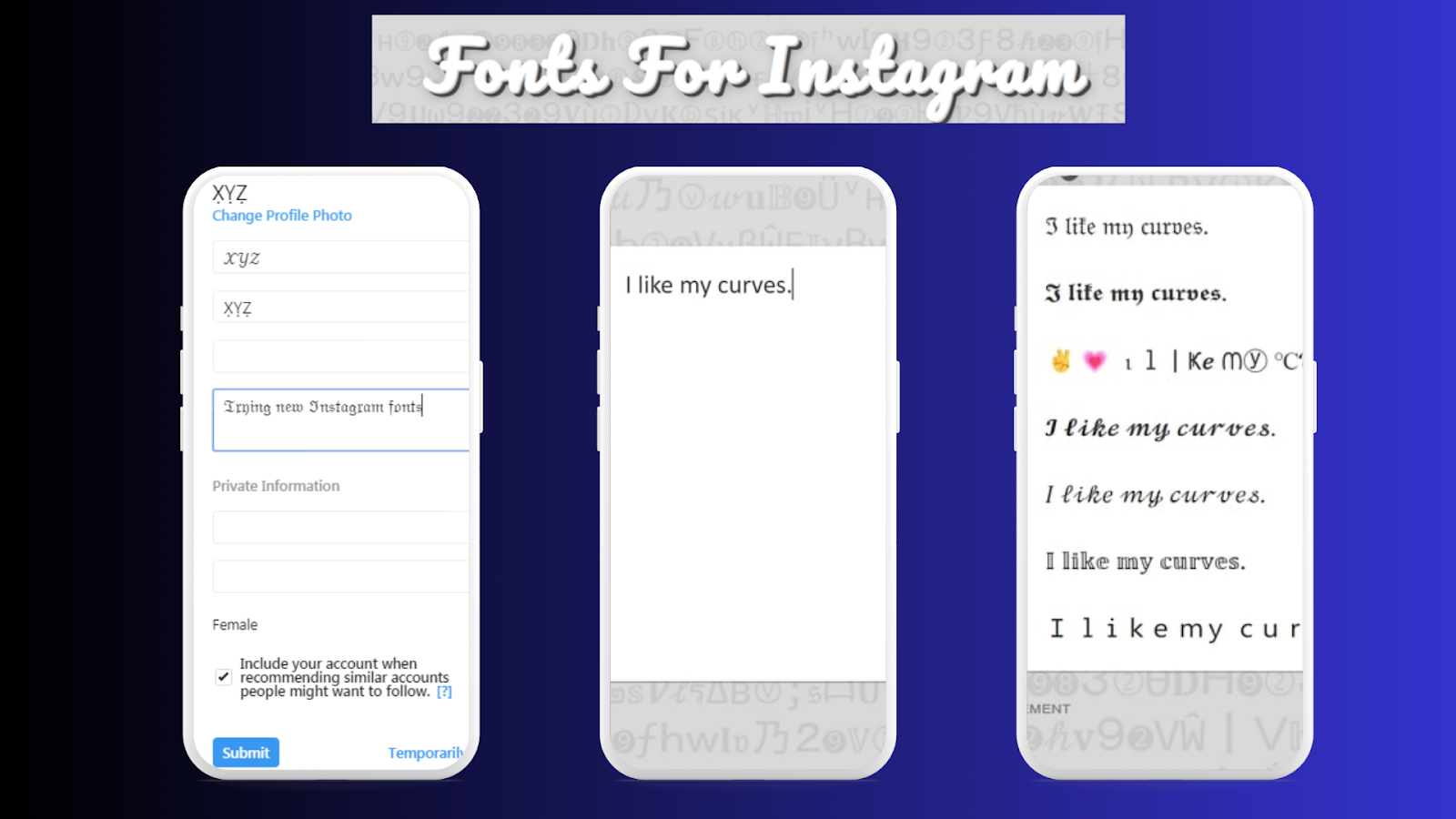
Step 2: Copy and Paste the Text into Instagram
When choosing your preferred font type, please copy and paste this text into the Instagram caption box using the copy-paste feature. It’s as simple as that! These social media fonts are also for Instagram and will look perfect in the post.

Step 3: Experiment with Font Styles
You should not be afraid of using different fonts for your Instagram captions. Consistently, some fonts are ideal for content standardization, while others are good for artistic or creative posts. You can use two or more script types higher for style.
Step 4: Limit Font Use
Attempts to use multiple fonts to create a fun and fancy look should be discouraged since they interfere with the overall readability of a piece. Too many consecutive font changes in a caption might make the captions wrong and difficult to read. In this case, it is safer to limit oneself to one or two font styles per post and then achieve equilibrium.

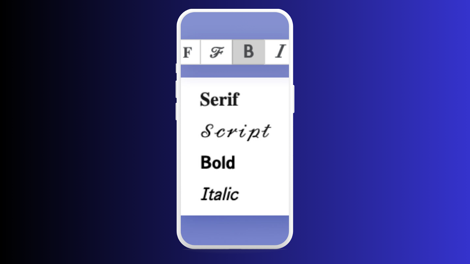
Types of Fonts You Can Use for Instagram Captions
If you’re considering experimenting with your Instagram font style, here are some popular options to consider. Some of these styles are wordmark inspired or represent a contemporary remix of classic typefaces, reflecting Instagram’s evolving brand identity.
1. Classic Sans-Serif Fonts
These fonts are non-serif fonts whose appearance lacks any decorative strokes on the endings of the strokes of the letters; these fonts include Arial, Helvetica and Open Sans. These fonts are ideal for standard Instagram captions and work best when you don’t want to emphasize the text too much but the content instead.
2. Serif Fonts
Unlike sans serif fonts, serif fonts, including Times New Roman and Georgia, have a more formal or elegant tonality to captions. If you wish for a more professional look or need to use text with different thicknesses but on the background of Instagram Sans, serif fonts will come in handy.
3. Script Fonts
They are less readable and can personally script and give captions a handwritten look. These fonts will be helpful to show creative people at work, especially when sharing quotes, invitations to events, or anything artistic.
4. Bold Fonts
It is advisable to use displaying fonts such as Impact or Bebas Neue to grab people’s attention to the parts of the caption. However, using specific elements, such as bold font, can help you get your point across or at least get someone’s attention to the text.
5. Decorative Fonts
If you want your captions to be even more eye-catching, try using some unique fonts that are rather detailed or even enclose specific patterns. These fonts are more fun to read and are best for events, campaigns, or anything affiliated with a business.
Examples of Custom Fonts
- 𝒯𝒽𝒾𝓈 𝒾𝓈 𝒸𝓊𝓇𝓈𝒾𝓋𝑒 𝓉𝑒𝓍𝓉
- 𝕋𝕙𝕚𝕤 𝕚𝕤 𝕕𝕠𝕦𝕓𝕝𝕖-𝕤𝕥𝕣𝕦𝕔𝕜 𝕥𝕖𝕩𝕥
- 𝔗𝔥𝔦𝔰 𝔦𝔰 𝔤𝔬𝔱𝔥𝔦𝔠 𝔱𝔢𝔵𝔱
5. Fonts in Instagram Stories and Reels
Instagram Stories and Reels allow users to add text overlays with a variety of built-in font options. The font does Instagram use for Stories and Reels includes a range of instagram stories fonts specifically designed for aesthetic appeal and creative flexibility, enhancing the platform’s modern visual identity. These fonts are part of Instagram’s design toolkit and include:
- Classic: A clean, sans-serif font similar to Instagram Sans.
- Modern: A sleek, minimalist font with a contemporary feel.
- Neon: A bold, glowing font perfect for eye-catching Stories.
- Typewriter: A monospaced font that mimics a typewriter’s look.
- Strong: A heavy, bold font for impactful text.
- Handwritten: A casual, script-like font that mimics handwriting.
These fonts are designed to complement Instagram’s creative tools, allowing users to customize their Stories and Reels with ease.
6. Fonts in Instagram Marketing and Ads
For official marketing materials and ads, Instagram often uses its custom font, Instagram Sans, to maintain brand consistency. Typography plays a crucial role in marketing materials, with key features like readability and brand consistency helping Instagram reach its billion active users. However, they may also use other popular sans-serif fonts like:
- Helvetica: A classic, neutral font often used in professional designs.
- Arial: A widely available alternative to Helvetica.
- Futura: A geometric sans-serif font with a modern feel.
These fonts are chosen for their readability and versatility, ensuring that ads look polished and professional across different platforms.
7. Why Fonts Matter on Instagram
Fonts play a crucial role in shaping Instagram’s visual identity and user experience. Instagram’s typography, including the introduction of Instagram Sans and other custom typefaces, is a key part of Instagram’s branding strategy. These font choices not only define the platform’s look but also influence how Instagram use impacts user engagement, visual storytelling, and overall brand perception. Here’s why they matter:
- Brand Consistency: Instagram Sans and system fonts help maintain a cohesive look across the platform.
- Readability: Clean, sans-serif fonts ensure that text is easy to read, even on small screens.
- Creativity: Custom fonts and text styles allow users to express themselves and stand out in a crowded feed.
- Accessibility: Fonts that support multiple languages and scripts make Instagram more inclusive for global users.
8. Tips for Using Fonts Effectively on Instagram
If you want to make the most of fonts on Instagram, keep these tips in mind:
- Keep It Simple: Avoid overloading your posts with too many font styles. Stick to one or two for a clean look.
- Match Your Aesthetic: Choose fonts that align with your personal or brand aesthetic.
- Use Custom Fonts Sparingly: While custom fonts can be fun, overusing them can make your content harder to read.
- Experiment with Tools: Explore Instagram’s built-in font options for Stories and Reels to add variety to your content.
- Choose a Custom Style: Select a custom style, such as Instagram Sans, that enhances the platform’s visual appeal and reinforces Instagram’s visual identity. Using unique typography helps create a cohesive and recognizable brand presence.
Using Instagram Font Styles in Stories
Apart from captions, the use of Instagram font style is also essential for Instagram Stories. Instagram Stories offer more font options than the captions on your regular posts, including:
- Classic: The default font for Stories.
- Modern: This is a new, cleaner, more streamlined typeface sector.
- Neon: Another font that has to do with neon lights gives that cool neon style.
- Typewriter: It is a font that resembles old-fashioned typewriter font.
- Firm: One of the most impactful and intriguing fonts, great for any text you want to stand out.
To change the font in your Instagram Stories, tap the “Aa” button after uploading your photo or video. From there, you can swipe through different font styles and choose the one that best fits your story. Without any doubt, Instagram stories and reels are the best way to keep visitors and followers hooked and grow your account.
Tips for Using Fonts on Instagram Effectively
To ensure that your Instagram font style enhances your content rather than detracts from it, here are some best practices:
- Match Your Font with Your Brand: If you’re a business or influencer, choosing a font that aligns with your brand’s personality is essential. Whether bold, modern, elegant, or minimalistic, your font should reflect your overall aesthetic.
- Maintain Readability: While using fancy fonts is tempting, ensure that the font you choose remains readable, especially for extended captions—fonts like Instagram Sans work best for clarity and ease of reading.
- Consistency is Key: If you use a specific font for your captions or stories, stick with it across all your posts to maintain consistency. This helps build a strong visual identity on your Instagram account.
- Don’t Overdo It: Too many different fonts can overwhelm your audience. Stick to one or two font styles and keep the design clean and balanced.
Conclusion
In summary, Instagram Sans is the default font for captions on Instagram, and it’s widely used due to its simplicity and readability. However, there are many ways to change the Instagram font style, such as using third-party font generators. You can create posts that stand out while maintaining clarity by experimenting with different social media fonts.
Even if you seek to spice up your captions or want to step your Instagram Stories up a notch, learning how to adjust your font is the basis of your customization toolkit for whichever social media platform you use. Please note that font is a critical aspect of its impact on the content, so it is advisable to spend lots of time choosing the right font for your disposition. For any query, please feel free to contact us. Thank you!
FAQs
Can I use custom fonts in Instagram captions?
Yes, you can use custom fonts by utilizing third-party font generators. These tools allow you to create unique text styles, which you can copy and paste directly into your Instagram captions for added flair.
What is the default font for Instagram captions?
Instagram captions use the system default fonts: San Francisco on iOS devices and Roboto on Android. However, Instagram’s branding often incorporates Instagram Sans, a clean and modern sans-serif font introduced in 2022.
How can I change the font on Instagram Stories?
To change the font on Instagram Stories, tap the “Aa” button after typing your text. Instagram offers a variety of font styles, including options like Classic, Modern, Neon, Typewriter, and Strong, which you can customize further with colors and effects.
Are all third-party fonts compatible with Instagram?
Most third-party fonts are compatible with Instagram. However, some complex or highly decorative fonts may not render properly across all devices, so it’s wise to test them in your drafts before posting to ensure they display correctly.
Can I use decorative fonts in my Instagram captions?
Yes, decorative fonts can make your captions stand out, especially for special announcements or creative posts. However, make sure the fonts remain legible and complement your content rather than distract from it.


