The font Instagram uses is not one font. It is three different fonts working in three different places, and most of the confusion online comes from people answering as if it were one.
The brand font, used in the logo, marketing, and parts of the interface, is Instagram Sans. The font you read your captions in depends on your phone. iPhone shows you SF Pro. Android shows you Roboto. And inside Stories and Reels, there is a small built-in font tray with names like Classic, Modern, and Strong.
This guide separates the three buckets clearly, names the fonts inside each one, shows you where they actually live, and explains how to change the Stories font when you want a different look.
The Short Answer Before The Long One
If you only have one minute, here is the cheat sheet.
- Brand font: Instagram Sans, custom-built for Instagram and released in the most recent rebrand.
- iPhone interface and captions: SF Pro, Apple’s system font.
- Android interface and captions: Roboto, Google’s system font.
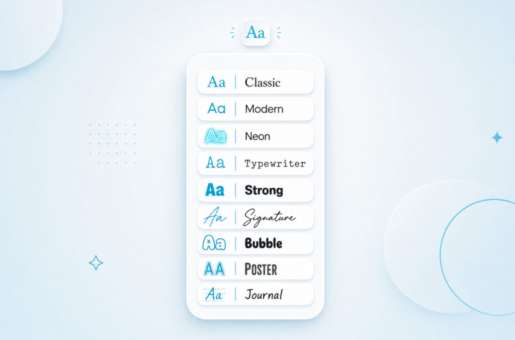
- Stories and Reels text tray: a small set of named fonts you tap through with the Aa button, like Classic, Modern, Neon, Typewriter, Strong, and several newer additions.
- The logo wordmark: a custom script drawn from Instagram Sans, not the old Billabong font you might remember from years ago.
That covers most questions. The rest of this article goes deeper on each piece.
Grow Your Audience In Minutes
Give your Instagram content the push it needs with fast delivery, simple packages, and creator friendly growth options.
Instagram Sans, The Brand Font
Instagram Sans is a custom typeface Instagram launched as part of the rebrand a few years ago. It was built in collaboration with Colophon Foundry, a London-based type studio known for clean editorial work.
The point of having a custom font is that Instagram does not have to share a typeface with every other app. The shape of the letters is part of the brand, the same way the gradient logo color is.
The Instagram Sans family
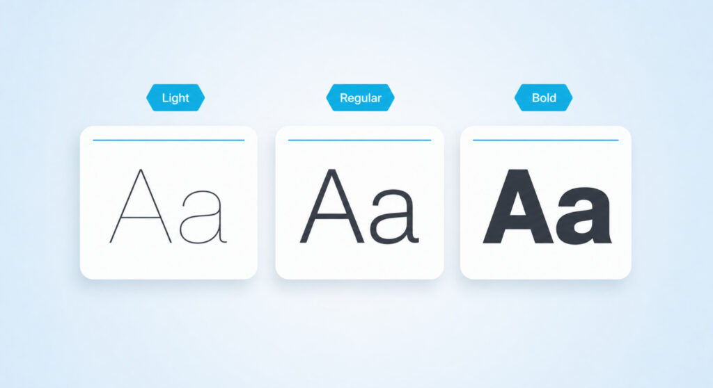
Instagram Sans is not a single weight. It is a small family designed to work together across product surfaces.
- Light: thin strokes, used for delicate labels or quiet moments in marketing.
- Regular: the everyday weight, used in most branded layouts.
- Medium: a half step heavier, used for emphasis without going full bold.
- Bold: used for short callouts, button labels, and headlines that need to anchor a layout.
- Headline: a separate cut tuned for very large display sizes, where Bold would feel too chunky.
Language support
Instagram Sans was designed with global reach in mind. It supports Latin, Cyrillic, Greek, Arabic, Thai, and several other writing systems out of the box, with regular additions as Instagram expands. That is why headlines in the official app feel consistent across countries instead of switching to a fallback font every time the language changes.
Can you use Instagram Sans yourself
Short answer: no. Instagram Sans is proprietary. It is not on Google Fonts, it is not on Adobe Fonts, and it is not for sale. Using it on a client brand, a t-shirt, or a website would be a licensing problem.
If you want a free font that gets you most of the way there in feel, the closest open-source options are Inter, Manrope, and Plus Jakarta Sans. They share the soft geometric character without copying the actual letterforms.
| Good to know: Instagram Sans is for Instagram. You will see it inside the app and in their ads. You will not see it in your own posts unless you screenshot it from somewhere. |
The Logo: A Billabong-To-Instagram-Sans Story
The Instagram logo wordmark, the actual word “Instagram” written in a flowing script, has gone through three distinct chapters.
- Chapter one, the Billabong era: when Instagram launched, the wordmark used Billabong, a retro script font created by Type Associates. It felt nostalgic and casual, fitting the original Polaroid-style aesthetic.
- Chapter two, the Mackey Saturday redraw: designer Mackey Saturday reworked the script into a custom wordmark that kept the Billabong feeling but added cleaner curves and modern proportions. This was no longer just a font, it was a logotype.
- Chapter three, the Instagram Sans Script: with the most recent rebrand, Instagram introduced a fresh script version drawn from the Instagram Sans system. It is the current wordmark, and it is what you see on the splash screen when the app opens.
So if a blog post tells you the Instagram logo is still Billabong, it is a few years out of date. Billabong was the inspiration. The current logo is its own custom script.
Your Phone Picks The Font You See In Captions
This is the part most articles get wrong. When you read a caption, a bio, or a DM inside the Instagram app, you are not reading Instagram Sans. You are reading whatever font your operating system uses by default.
On iPhone and iPad
Apple devices show you SF Pro, the system font Apple designed for iOS, iPadOS, and macOS. SF Pro is tuned for small screens, with subtle adjustments at smaller sizes that keep it sharp even on a phone held at arm’s length. Instagram defers to SF Pro because it loads instantly, it scales with your accessibility settings, and it makes the app feel like a native Apple app instead of a separate world.
On Android
Android devices show you Roboto, Google’s default system typeface. Roboto has slightly more geometric construction than SF Pro, with open curves and a friendly, neutral tone. It has been the default Android font since the early Android versions, and Instagram uses it for the same reason it uses SF Pro on iPhone: it is already there, it is fast, and it respects your phone’s text size settings.
Why the same caption looks different on two phones
If you have ever sent a screenshot to a friend and they said the text looked different, this is why. Your caption text is not stored as an image. It is rendered fresh on each device using that device’s system font. iPhone reads it in SF Pro. Android reads it in Roboto. Web reads it in whatever the browser falls back to. The words are identical. The shapes are not.

Where Each Font Actually Shows Up
Putting all three buckets next to each other makes the picture clearer.
- App splash screen and logo: Instagram Sans Script (the custom wordmark drawn from Instagram Sans).
- Big in-app banners, ad creative, official marketing: Instagram Sans, mostly in Bold and Headline weights.
- Buttons, menu labels, settings screens on iPhone: SF Pro.
- Buttons, menu labels, settings screens on Android: Roboto.
- Feed captions, bios, comments, DMs (iPhone): SF Pro.
- Feed captions, bios, comments, DMs (Android): Roboto.
- Stories and Reels text overlays: whatever you pick from the Stories font tray.
- Instagram on the web (browser): a CSS stack that prefers SF Pro on Mac, Segoe UI on Windows, Roboto on Android Chrome, and falls back to a generic sans-serif.
| Tip: If a designer asks you what font Instagram uses, the correct answer is “Instagram Sans for the brand, system fonts for the content.” Both halves matter. |

The Stories Font Tray, Renamed And Expanded
When you tap the Aa button on a Story or a Reel, you get a small row of named fonts. The original set has been stable for a few years. A bigger refresh added new options and gave each one a personality name.
The original lineup
- Classic: a clean sans-serif, the default. Good for captions you want people to actually read.
- Modern: thinner and more geometric, a minimal feel. Works for fashion and design content.
- Neon: a glowing script that looks like a lit sign. Heavy decoration, works best on dark backgrounds.
- Typewriter: monospaced, mechanical, vintage. Pairs with journaling and behind-the-scenes moments.
- Strong: a bold condensed display font, built for single big words and announcements.
- Elegant: a high-contrast serif with thin verticals. Sophisticated, editorial.
- Directional: a clean tall sans with a navigational, signage feeling.
- Literature: a softer serif that feels like book body text.
The newer named additions
The Stories tray expanded with a fresh batch of personality fonts that rotate in and out over time.
- Signature: a mixed-case handwriting style that looks like a personal note.
- Editor: a retro spaced serif for formal announcements.
- Bubble: soft, rounded, playful. Friendly and approachable.
- Deco: confident, alternative, with a touch of flair.
- Poster: bold with expressive serifs, designed to be the focal point.
- Squeeze: tall, expressive, loud. Built for short phrases.
- Journal: a cursive, handwritten feel that suits diary-style captions.
The exact lineup you see depends on your app version and region. Update the app if you are missing fonts your friends have. Some seasonal display fonts also rotate in and out, especially around the end of the year.
How To Change The Font Inside Stories
Once you know the names of the fonts, switching between them is a four-step routine.
- Open the camera and capture or upload your background image or video.
- Tap the Aa text button at the top of the screen.
- Swipe horizontally through the font row. The current font name appears above the keyboard, so you can see which one is active.
- Type your text. Tap and drag with two fingers to scale and rotate, or use the size slider on the left.
Two extras most people miss
- The highlight cycle: tap the highlight icon (it looks like an A with a filled square behind it) to toggle through three states: plain text in your chosen color, text on a solid color block, and text on a semi-transparent color block.
- The shadow trick: type your text in a dark color, type the same words again in a lighter color slightly smaller, and stack the lighter copy on top with a small offset. Instant drop shadow without leaving the app.
| Quick check: Long-press your text after placing it. The font row reopens, and you can swipe to a different font without retyping a single word. |
Want your Instagram to actually take off?
Real accounts. Real engagement. No bots, no shadowbans, ever.
See our Instagram servicesCustom Fonts From Outside The App
The built-in tray is the only set of true fonts Instagram offers natively. There is no hidden menu to unlock more. If you want a look that is not on the row, you have two workarounds, each with trade-offs.
Workaround one, paste Unicode characters
Sites like LingoJam, Cool Symbol, and Fonts for Instagram generate stylish characters that look like fancy fonts. They are not actually fonts. They are Unicode symbols that happen to look like styled letters.
To use them, type your text on the generator site, copy the styled version, and paste it into your Instagram caption, bio, or Story text. It works almost everywhere on the app.
The trade-off is accessibility. Screen readers cannot read most of these characters correctly. If accessibility matters to you, use them sparingly and only on text that is not your main message.
Workaround two, design in Canva and upload as an image
For Stories and Reels covers, you can build your text in Canva, Phonto, Over, or any design app using any font you have a license to. Export it as a transparent PNG or a 1080 by 1920 image, upload it as your Story background, and you have full creative control. This is how most brand accounts get their custom typography on the platform.
| Tip: Unicode fonts in your bio look fancy, but they hurt search inside Instagram. If someone is searching for your business name, plain text wins every time. |
Myths We Should Retire
A lot of older blog posts still pass along font claims that were either always wrong or have aged badly.
- “Instagram uses Proxima Nova for the interface.” Out of date. Proxima Nova was used on the early web version, not the apps. The current apps use SF Pro on iOS and Roboto on Android.
- “Instagram uses Neue Helvetica everywhere.” Same problem. Neue Helvetica appeared briefly in older marketing, not in the modern app.
- “The Instagram logo is Billabong.” Only true for the very first version. The wordmark has been a custom script since 2013, and the current one comes from the Instagram Sans family.
- “There is a secret font menu if you type a magic word.” There is not. Some posts claim typing “papyrus” or similar phrases unlocks hidden fonts. It does not. The tray is the full set.
- “Freight Sans is the Android font.” Wrong. Freight Sans showed up in older third-party guesses. Android has been on Roboto for years.
Two Fonts, Used Everywhere, Is Usually Enough
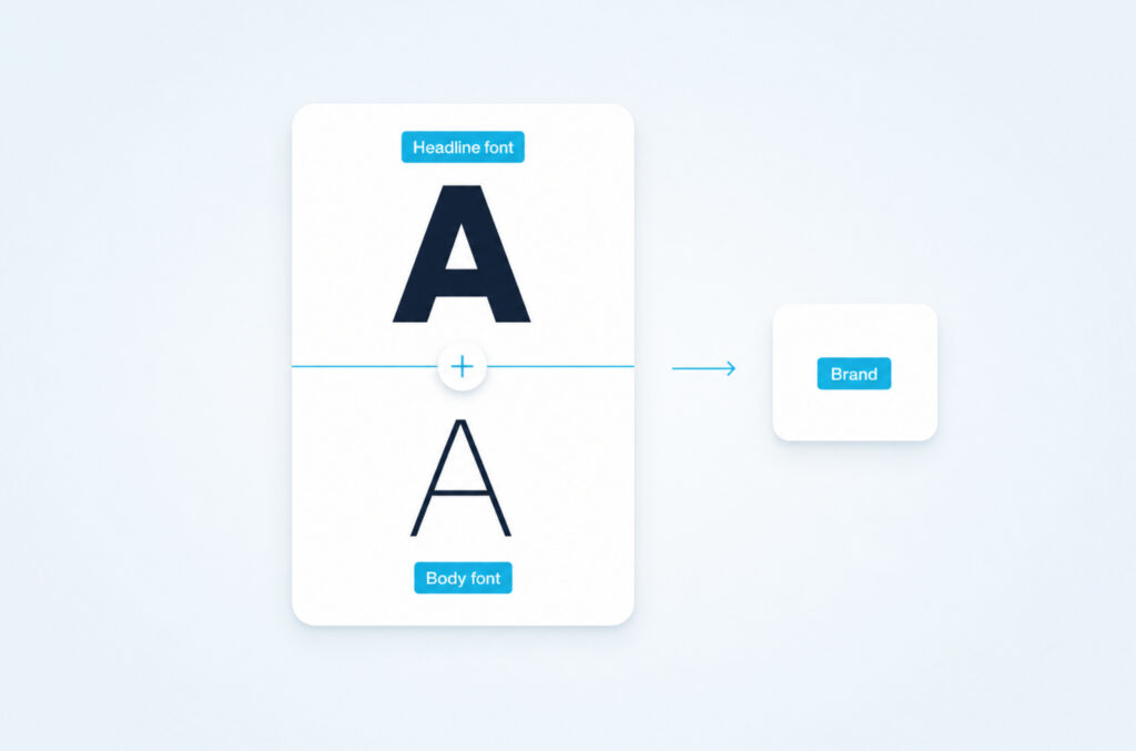
If you run a creator account or a small business page, you do not need to pick from twelve Stories fonts on every post. A clean brand picks two and sticks with them.
- A headline font: something with personality. Could be Strong, Editor, Poster, or a paid font you use in Canva covers.
- A body font: something neutral and readable. Classic and Modern are both safe defaults for Stories.
Use the headline font for the first line on every Story and Reel cover. Use the body font for everything else. Six months from now, someone scrolling past will recognize your posts before they even read your handle. That is the whole point of typography on a feed.
FAQs About Instagram Fonts
What font does Instagram use right now?
Three at the same time. Instagram Sans is the brand font you see in the logo, ads, and big in-app banners. SF Pro is what you read on iPhone. Roboto is what you read on Android. Stories and Reels add a separate font tray on top with named styles like Classic, Modern, and Strong.
Is Instagram Sans free to use?
No. Instagram Sans is proprietary. It is not licensed for outside use, and it is not on Google Fonts or Adobe Fonts. If you want a similar feel for free, Inter, Manrope, and Plus Jakarta Sans get you most of the way there.
Why does the same caption look different on my iPhone and my friend’s Android?
Because the caption is rendered live in your device’s system font. iPhone uses SF Pro. Android uses Roboto. Same words, different shapes. The font is not stored with the post.
Was the Instagram logo always Instagram Sans?
No. The original logo used Billabong, a retro script. It was redrawn into a custom wordmark by Mackey Saturday in the years that followed, and the current script comes from the Instagram Sans family introduced in the most recent rebrand.
What was the old Instagram font in the logo?
Billabong. It was created by Type Associates and gave the early app its nostalgic, surf-style feel. It is still available as a commercial font, but the modern Instagram wordmark is its own custom drawing.
How do I get more fonts in Instagram Stories?
Update the Instagram app first. The font tray refreshes with new options over time, and older versions of the app miss the newer ones. Beyond that, the tray is the full native set.
Why do I not see Signature, Editor, or Bubble in my font tray?
New fonts roll out gradually and can be limited by region or app version. Force-close the app, update it from the store, and reopen Stories. If they still are not there, your account is not in the rollout yet.
Can I paste my own custom font into a caption?
Not a real font, but you can paste Unicode characters from a generator site that look like styled letters. They display almost everywhere on Instagram. Screen readers struggle with them, so use them lightly.
What is the closest free font to Instagram Sans?
Inter is the closest free match for body and UI text. Manrope is a touch softer if you want a friendlier feel. Plus Jakarta Sans works well for headlines. None of them are identical, but they share the geometric character.
Does the font I pick in Stories affect reach or the algorithm?
No. Instagram does not rank Stories or Reels based on font. Pick the one that reads cleanly on a small screen and matches the vibe of your post. Readability is the only thing that quietly helps.
Pick Two Fonts, Stay Consistent, And Let The Photos Talk
Knowing that Instagram uses Instagram Sans, SF Pro, and Roboto in different places is useful. Knowing what to do with that information is more useful.
Inside the app you cannot change the caption font. Your phone decides. Inside Stories and Reels you have the font tray, plus the Unicode workaround and the Canva-upload workaround when you want something custom.
Pick a headline font and a body font, use them on every Story cover, and let your photos do the rest of the work. Typography on Instagram is supposed to be quiet. The image is the loud part.